
MORE POURING, LESS BORING
More or Less is a first of its kind Non-Alcoholic retail store in Grand Rapids, Michigan. After a name change, they needed to re-brand quickly to something more scalable while keeping all the momentum from their store opening buzz.
SERVICES: Brand Strategy, Brand Identity, Marketing Strategy
Design Advisors: B. VanGessel, S. DeMeester

THE ASK
Create a working brand guide that keeps the existing retail aesthetic, but updates and differentiates it from the old brand name. The new name, More or Less, represents the inclusive philosophy of serving all cocktail enthusiasts, not just the strictly sober.
Goals: A playful, retro inspired visual brand that attracts cocktail enthusiasts and sobriety seekers alike.
Keywords
Light-hearted
lively
colorful
playful
inclusive


THE SOLUTION
The CA Negroni typeface nods to vintage spirit labels, infusing the main wordmark with a lively, playful vibe. The arched styling of the main logo calls back to classic hand-painted signs.

Owners Chad and Neil wanted a versatile color palette for collaborations, product lines, and digital presence.
Their color system features 5 deep "ground" colors, 5 vivid "bright" colors, and essential black and white, enabling endless mix-and-match possibilities.


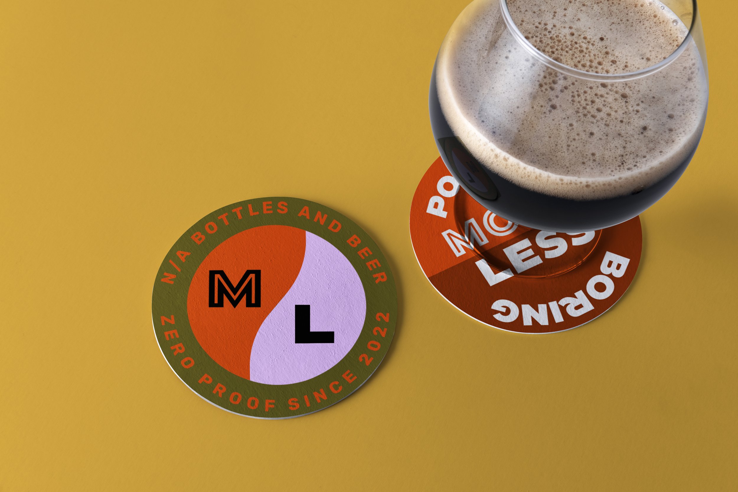


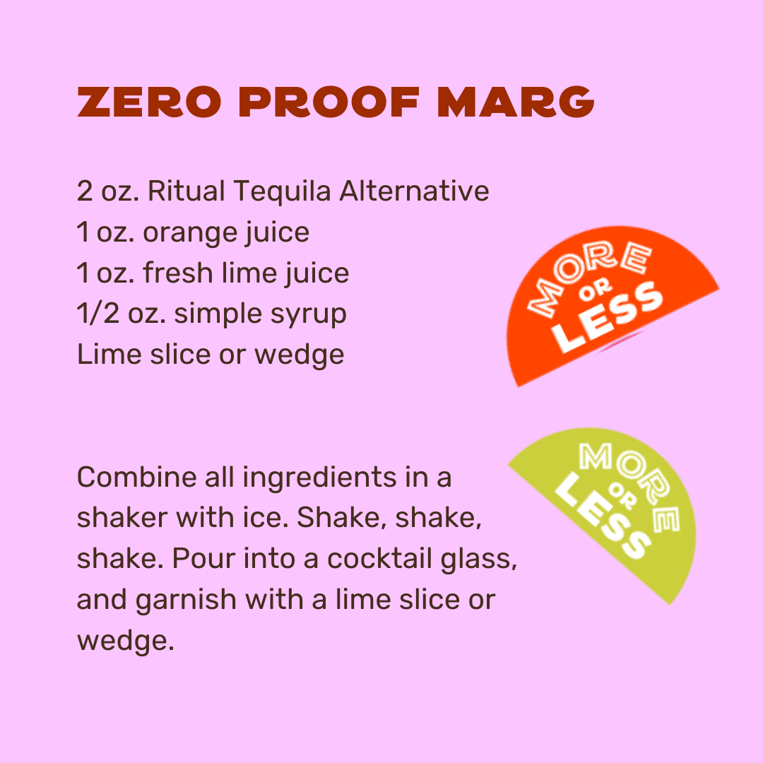


BRINGING THE FUN
We wrapped up this brand kit with a set of colorful drink icons, patterns, and badges with social media and merch in mind.